
COVID-19 Neighboring State Analysis
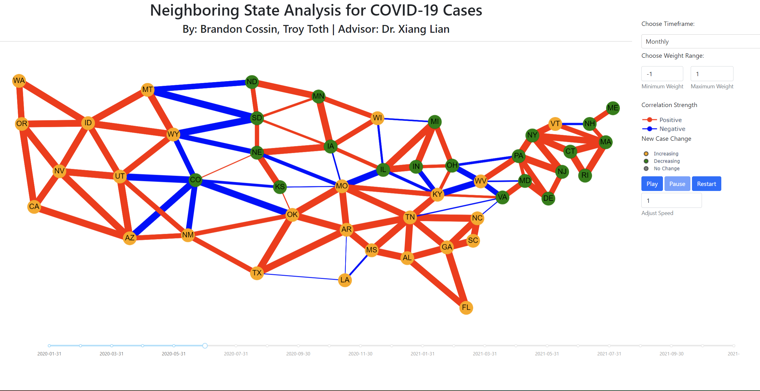
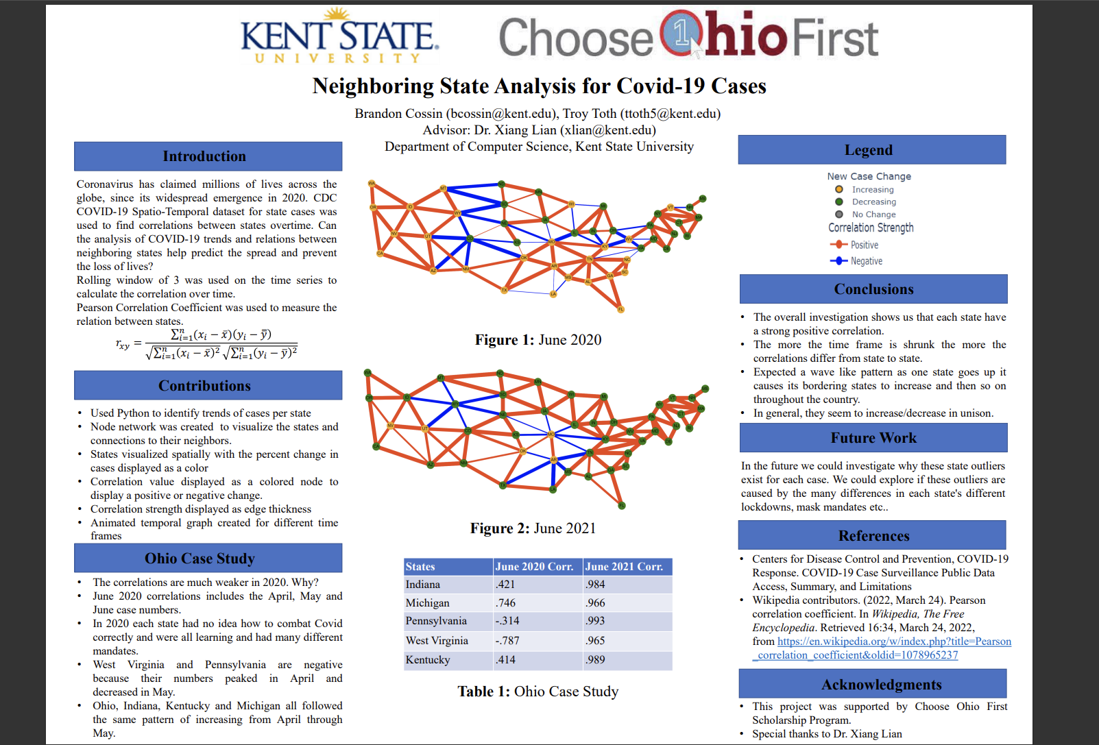
Plotly Dash interface to visualize correlation of COVID-19 cases compared between neighboring states in order to find trends to help predict the spread of COVID-19. Weekly, Monthly, Bi-Annually, and total windows analyzed. Cytoscape used to create a network graph over time of nodes(states) and edges(correlation). This project was for Choose Ohio First and was presented on April 10th 2022.
E-Commerce Site
Shopping website that allows the user to access and view products from a database using PHP combined with MySQL.Users also will be able to create an account/log-in, sort items by search or by filters, and add items to a cart. The user may delete items in their cart or their own account.